Useful Dashboards for Tracking the Coronavirus [1]
Track the Coronavirus around the world in real time with these dashboards.
These dashboards aggregate data and create maps and visuals that various information about the Coronavirus, where it's been, current statistics, where it's spreading, and its epidemiology and transmission.
There are many dashboards tracking the Coronavirus, not all of them are created equal. Here are some of the ones that use data from a variety of accurate sources and have unique and useful features or focus.
The actual name of the virus is SARS-CoV-2. The name of the disease it causes is COVID-19. The "type" of virus is a Coronavirus. These terms and COVID-19 seem to be used interchangeably. The WHO (World Health Organization) named the disease [3]. For the purposes of this article, "Coronavirus" will be used.
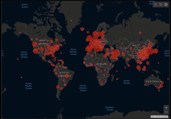
Johns Hopkins University [4](JHU)
This is the most popular dashboard, not only for its appearance and interactive features but because data is updated in real time and has a mobile version. The dashboard shows the location and number of confirmed COVID-19 cases, deaths and recoveries for all affected countries. Zooming in on an area and clicking the red dot shows how many cases in that location that are confirmed, recovered, active, and deaths. You can view actual, logarithmic and daily cases.
Bing COVID-19 Tracker [5]
This dashboard is easy to use and has a clean and minimal interface. It has the standard amount of information with the addition of related news stories when clicking on a country.
Healthmap [6]
This dashboard is a bit scarce on details but has a good animation of the history and current status of the spread of the Coronavirus.
The New York Times [7]
This dashboard is very easy to read and shows each information related to each continent, with links to other stories. It's not interactive and isn't updated in real time, though still a good resource.
NextStrain [8]
This dashboard is for anyone interested in the genomic epidemiology of the coronavirus. The transmission animation is particularly well done.
nCoV2019.live [9]
This dashboard has a very easy to use interface with data display that's updated in real time, a separate map display, a wiki, and a newsletter. If you click on an location a side box appears with relevant information, links to government sites where available and photos from Google Maps. Very well done and impressive because it's done by a person high school in the USA as a coding project. Features are added with input and requests from site visitors.
List of Novel Coronavirus Dashboards [10]
This is a list of Coronavirus dashboards that have been created with the Esri [11]platform, the same platform as the Johns Hopkins dashboard. Quality varies but there are some interesting dashboards in different areas like a dispersion daily update and some that are focused on certain countries or areas.
You can find more Tech Treats here [12].